
The cover of Beyond the Power of the Magnet was conceived as a visual representation of the fundamental principle of magnetic therapy:
the human body as a dynamic energetic system that responds to polarity, flow, and balance.
Nothing in this design is decorative by chance.
Colors, shapes, and movement express how magnetic fields interact with the body to support regulation, activation, and natural well-being.
The upper section: calm, regulation, and balance
Blue and green tones — North Pole (–)
The upper portion of the cover uses a palette of blues and greens, colors traditionally associated with calm, healing, and balance.
From the perspective of magnetic therapy, these tones represent the North Pole of the magnet (North –), known for its:
-
Sedative
-
Calming
-
Regulatory effects
This pole is associated with normalization and balance processes, particularly when the body needs to reduce excess activity or restore functional stability.
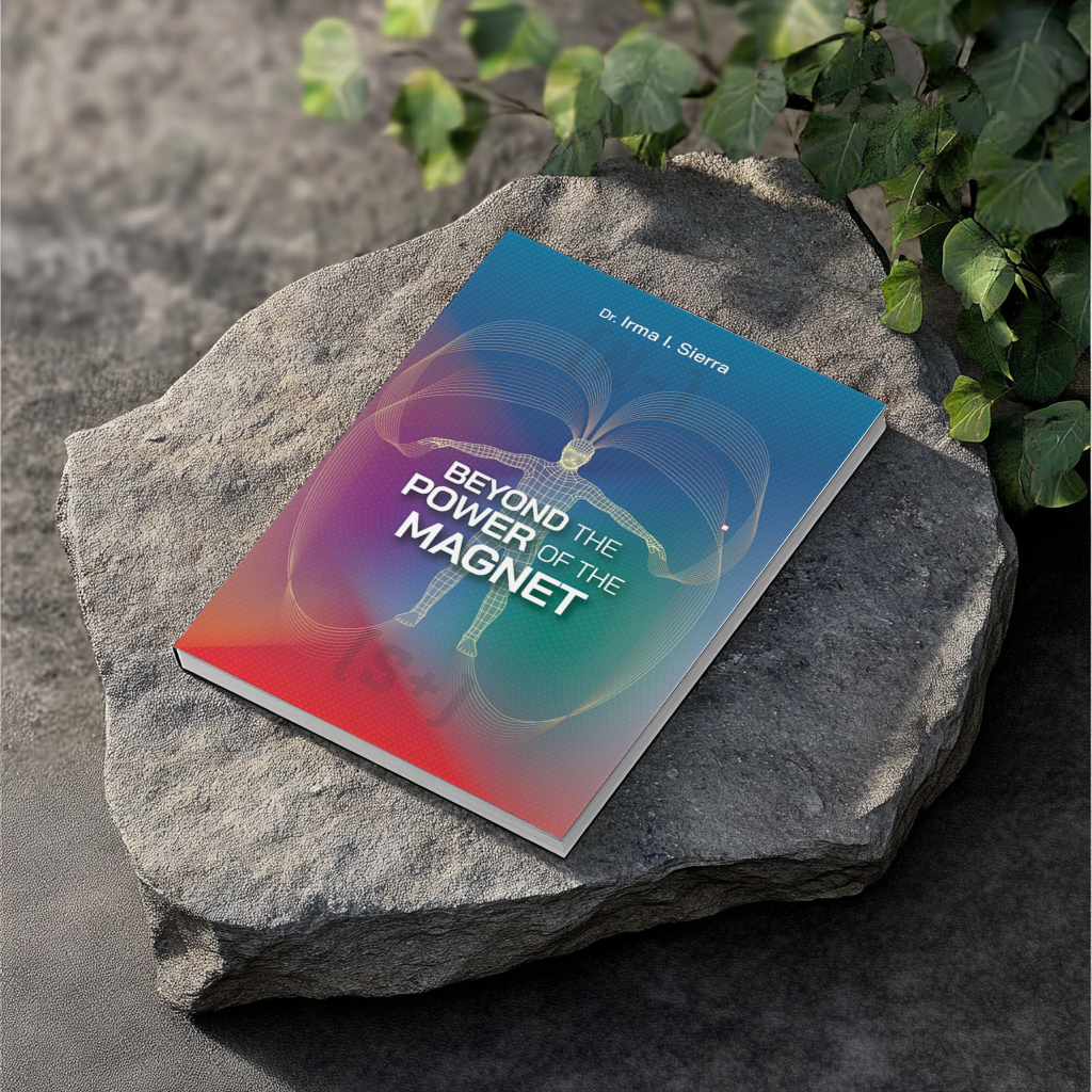
The lower section: energy, activation, and vitality
Red tones — South Pole (+)
In contrast, the lower part of the design blends into red tones that symbolize:
-
Energy
-
Movement
-
Activation
-
Vitality
These colors represent the South Pole of the magnet (South +), associated with a stimulating and energizing effect, used when the body requires local activation or functional support.
The central human figure: the body as an energetic field
At the center of the cover appears a human figure outlined not as a solid body, but as an energetic structure.
This figure:
-
Is centered and balanced between both poles
-
Represents the human being as a living field, sensitive to its environment
-
Reflects the body’s natural capacity to self-regulate when magnetic fields are applied appropriately
Here, the body is not presented as a machine, but
as an intelligent system in constant interaction.
Curved waves: the flow of the magnetic field
The golden curved lines that emerge and surround the figure symbolize the magnetic field in motion.
These waves represent:
-
The continuous flow of energy
-
The interaction between the body and the magnetic field
-
A living, dynamic, and enveloping system
They are not rigid lines, but soft curves,
reinforcing the idea of harmony and energetic coherence.
The gradient background: integration of the poles
The background of the cover does not divide—it integrates.
-
At the top, the cool tones of the North Pole (–)
-
At the bottom, the warm tones of the South Pole (+)
This gradient expresses an essential principle of biomagnetism: health does not depend on a single pole, but
on the balance of the system, applying the appropriate pole at the right time and in the right place.
The magnetic principle communicated by the cover
The image visually conveys a key concept of magnetic therapy:
-
The North Pole (–) calms and regulates
-
The South Pole (+) activates and energizes
When these poles are applied correctly, a harmonious energetic flow is created that supports recovery, well-being, and the body’s natural vitality.
The cover of Beyond the Power of the Magnet does not merely introduce a book.
It introduces a different way of understanding the human body, energy, and health— through balance, respect for the body’s intelligence, and the correct application of magnetic fields.
With magnetic energy,
Dr. Irma I. Sierra
I offer these readings so you may carry them with you, and from my heart, I hope you never forget them.
Because for me, biomagnetism is not only a field of study.
It is a way of life.
Knowledge awakens… but daily application transforms.
Since 1985, promoting the natural power of magnets for your health.
Discover everyday magnetic wellness tools at Health Magnetic Store & More.
Comments